Logos:
Logo Design & Layouts
The Anasuria logo is comprised of a distinct and memorable logomark with bold, clean typography to represent the forward thinking and modern attributes of the company. The mark is made up of elements that represent various aspects of the operation. The diamond at the centre of the icon not only symbolises the fixed position of the FPSO and the singular focus of the business, but also the professionalism of the company. The droplet shape is divided in a way that also creates a North pointing arrow, representing the North Sea operations. That arrow can also be seen as the letter ‘A’, acting as a monogram for the brand.

Our primary logo lockup which should be used where possible.

The landscape lockup should be used where left aligned with content or where the primary logo lockup doesn’t fit.

A simplified lockup with to be used where tag line text becomes difficult to read. Landscape version also available.

The word mark should be used where space is limited and the logo mark becomes unclear.

The logo mark should be used for smaller, 1×1 applications such as the website favicon and social media profile pictures.
Colour Variations
These are the various colour options available for each logo. Always use the correct version for the background it’s being used on as demonstrated below. Use the full colour versions where possible or the black and white versions where colour output isn’t possible (e.g. Specific print runs or embroidery). Always aim for maximum contrast between the logo and the background it’s being placed on.

Minimum Spacing
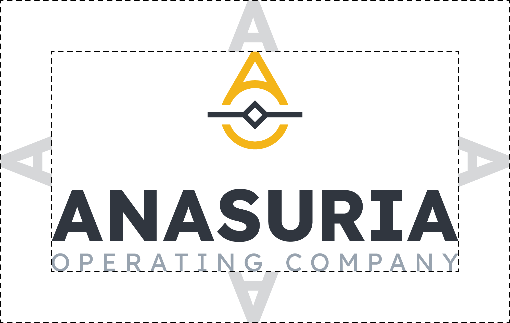
Us the height of the letter ‘A’ in ‘Anasuria’ to determine the minimum spacing around the logo. This not only applies to positioning on a page/screen, but also means no other elements or pieces of content should appear within this area.
Prohibited Usage
Below are examples of what to avoid when using any of the brand logos. DO NOT: skew/distort the logo; place within a holding shape; use the incorrect colour version for its intended setting; rearrange the logo elements; recolour any/all logo elements; change logo fonts; place elements within the minimum logo spacing area; use the incorrect logo version for the size of output.
Colours:
Primary Brand Colours
These are the primary brand colours and are to be used where possible. These have been carefully selected to represent the bold and modern attributes of the operation and with versatility in mind. High contrast and legibility is another key factor in these brand colours and is something that should be considered when using these with one another.
AOC Dark Grey is the main brand colour and should be utilised more than any other. Use it for body copy, dark backgrounds and for monochrome imagery where possible.
AOC Dark Grey
Hex: #313435
R:49 G:52 B:53
C:71 M:63 Y:61 K:57
PMS: 447 C
AOC Yellow is the brand accent colour and should be used to highlight key areas or elements. Links, alerts, buttons and call-to-actions should all utilise this colour.
AOC Gold
Hex: #f4b519
R:244 G:181 B:25
C:4 M:30 Y:100 K:0
PMS: 7409 C
AOC Mid Grey is to be used on lighter backgrounds and for content that’s to appear more subtle. Elements such as dividing lines can utilise this colour to allow other elements to stand out more.
AOC Mid Grey
Hex: #98a3af
R:152 G:163 B:175
C:43 M:30 Y:24 K:0
PMS: 7543 C
AOC Light Grey is to serve the same function as AOC Mid Grey but on dark backgrounds.
AOC Light Grey
Hex: #bdc7d1
R:189 G:199 B:209
C:25 M:16 Y:12 K:0
PMS: 5445 C
Secondary Brand Colours
These are the secondary brand colours. These should be used sparingly, and only when there is a need for separation from the primary colours such as complex categorisation of content.
AOC Turquoise
Hex: #46ce8d
R:70 G:206 B:141
C:64 M:0 Y:62 K:0
PMS: 7479 C
AOC Blue
Hex: #3fc2e0
R:63 G:194 B:224
C:63 M:1 Y:9 K:0
PMS: 637 C
AOC Orange
Hex: #ef8130
R:239 G:129 B:48
C:0 M:60 Y:62 K:0
PMS: 1575 C
AOC Red
Hex: #db3b4b
R:219 G:59 B:75
C:8 M:91 Y:69 K:1
PMS: 710 C
Typography:
Primary Brand Typeface
Lexend is the primary typeface for the Anasuria brand. It’s a clean, geometric sans serif typeface that embodies the organised and clinical attributes of the company. The font family contains a variety of weights so offers flexibility in its use.
Lexend
Light Regular Medium SemiBold Bold Black
aåbcçd∂eéfƒghiîjklmµnñoøpqœrstuüvwxyz
AÅÂBCÇDEFGHIÍJKLMNOØÓÔÒPQRSTUVWXYZ
0123456789º(.,’”-;:)!?&©˙˚π®†≈◊™£¢∞§•ªº
Secondary Brand Typeface
Space Mono is the secondary typeface for the Anasuria brand. It’s a technical looking, monospaced typeface that works well for smaller copy, technical information and stats. It can also be used to create clearer separation from elements utilising the primary typeface.
Space Mono
Regular Bold
aåbcçd∂eéfƒghiîjklmµnñoøpqœrstuüvwxyz
AÅÂBCÇDEFGHIÍJKLMNOØÓÔÒPQRSTUVWXYZ
0123456789º(.,’”-;:)!?&©˙˚π®†≈◊™£¢∞§•ªº
Tertiary Brand Typeface
Arial is the tertiary brand typeface and is the default computer font fallback if either of the other typefaces cannot be used. It can also be used over the other typefaces for internal materials.
Arial
Regular Bold
aåbcçd∂eéfƒghiîjklmµnñoøpqœrstuüvwxyz
AÅÂBCÇDEFGHIÍJKLMNOØÓÔÒPQRSTUVWXYZ
0123456789º(.,’”-;:)!?&©˙˚π®†≈◊™£¢∞§•ªº
Imagery:
Photography Style
The Anasuria brand utilises high resolution, professionally taken photography. The quality of images used within the brand reflect the quality and professionalism of the operation.
We use both full colour and monochrome imagery that uses the AOC Dark Grey colour to simplify content and draw attention to key elements. Either can be used, but we urge that full colour imagery is only used where the colour adds to the messaging.


Background Imagery
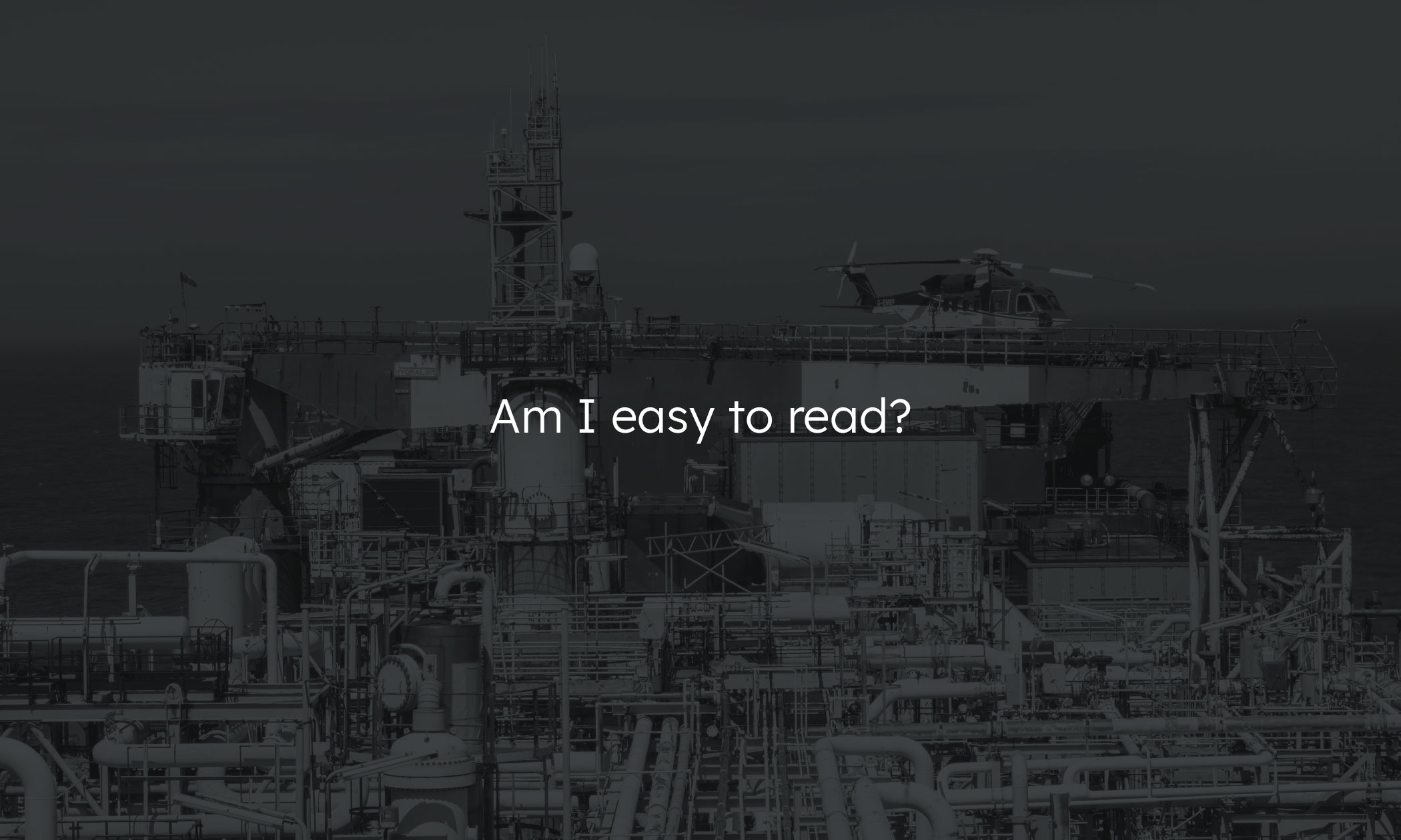
Always use the pre-edited background images when placing any content over an image. These have been converted to monochrome and darkened to ensure clear contrast with white text or lighter graphics.

Stock Imagery
In cases where we don’t have an image for a specific piece of content, stock imagery can be used. When selecting stock imagery ensure that the photography matches the style of our in-house photography. Ensure that they are generic and don’t contradict or falsify what we do as a company.
Brand Elements:
Patterns
A simple grid pattern has been created for use in areas otherwise empty areas of content. The subtle versions of each pattern colour can be used as backgrounds for other content where background imagery is not suited.
